
A successful website renovation requires discipline, vision, empathy, and organization.
Over the course of the last 12 (!) years, I have had the pleasure and pain of redesigning, at least 10 websites. I’ve re-imagined sites for media companies, non-profits, mental health professionals, a library system, and myself a time or two. Some of these were just minor remodels, and others were whole house builds.
When it became apparent that my company, Cerkl, had outgrown our current web home and would need another one quickly, I knew I would have to summon all of my experience and expand quite a bit to meet this big goal. And I was here for it.
Cerkl Site History
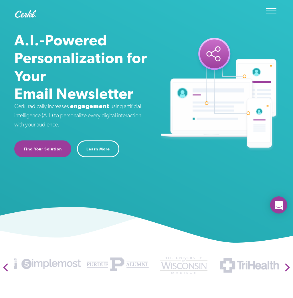
The Cerkl site as it stood over a week ago was built 17-months ago by a contractor. It was created for a time when our efforts were focussed on grabbing the attention of marketers. Full of vector graphics, and many, many card styles, the site was cool, but the management of it was heavy. Every page had to be written from scratch and adding and deleting required the attention of our very busy development staff. No good.
When I stepped into the Director of Product role last November, we begin discussing a product-specific approach to our website, and product.
Man, that was a lot of uses of the word “product.”
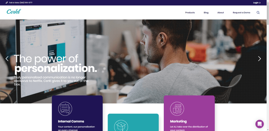
We would have three products, Cerkl for Internal Communications, Cerkl for Higher Education, and Cerkl for Marketing. With this vision in mind, I had to imagine a new site where all of these options could be fully developed, and their content, pricing, and messaging could live separately, but together.
Instead of a house, I was designing a triplex. Okay, I had a vision.

Choosing a Theme
I went to Envato to shop for a new theme. I fell in love with a theme that was clean and modern, but had an undercurrent of trust. Bingo. In previous remodels, I had made the mistake of losing the essence that drew me to a theme by not matching their color scales and styles. I began by looking at the color conventions we were using on the old site and in the Cerkl product.
A full re-brand would take us too much time, so I had to work within the logo and palette to bring forth something new that reflected a more enterprise style of site and design. I decided to associate each product with one of our main colors and to bring the tertiary color to primary, and to swap the secondary for tertiary.
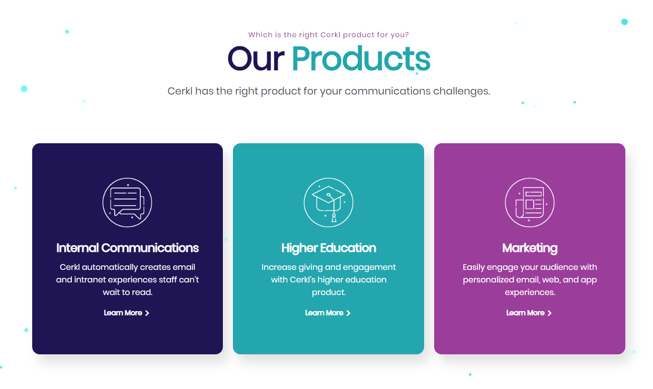
In real human words, blue = primary = Internal Communications (our main focus), teal = secondary = Higher Education, purple = tertiary = Marketing.
Theme demo sites exist in a world where you can pick blush pink and dark gray as your colors because you never have to print anything or make a t-shirt. They just have to be beautiful. How could I apply our dark, saturated colors to a theme I was drawn to because of its lightness?
I needed to log what I liked about the theme site. So I opened a Google Doc, and started logging the button, link, box colors, and opacities to decode what worked about the demo site. Patterns began to emerge.
Organizing Color
Now I needed a way to bring the demo site color conventions to our palette. Enter http://www.colorbox.io/ by Lyft. Yes, that Lyft. Our Lead Designer was obsessed with this site. I could see why. What you do is enter your color code and then you can generate a scaled color palette on the fly.
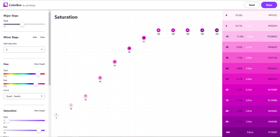
The colors are numbered, giving you a language to share across the organization beyond hex. Inside my trusty Google Doc, I added the color scales from Colorbox for my blue, teal, and purple, plus one for our text gray, and background gray. Now all my color decisions were essentially made. If I operated within the rules and scales I set for myself, the live site would look like Cerkl but have a consistent color theme throughout.
Breaking Ground
Now it was time to start building. The goal was a Minimal Viable Product or MVP. Knowing that this didn’t have to be THE version of the site we kept for a year kinda freed me from feeling like every decision I made was so heavy. Since the site was template-based and built on WP Bakery, I knew changes would be easy to make.
We tried a few things to port over what we could from the old site, but in the end, we just brought over the blogs and the media library. This was truly going to be a whole new thing. I downloaded the demo site with content and decided to use their beautiful, pre-fab pages as a template for our site. To keep those pages “pure” I used Duplicate Page to copy the pages, and edited the copied pages. You know, just in case I wanted to go back to the original if I got off track.
For a few days, I wrestled with the menu structure and function to be sure I accounted for all the possible paths. I logged all the pages that needed to be created and I looked for ways to simplify publication tasks, like webinars, to bring them inside the blog function to save time and increase exposure.
Trello Keeps the Project Moving
To help assign tasks and keep everyone up to date on the progress, I used Trello to manage the project.
In the beginning, the Trello board was just lists for me and the developer I would work with when I had code needs. When we finished a task, it went to Done.
As the project progressed, the Trello board evolved into a punch list of tasks that needed to be completed before we could go live, tasks for right after launch, and long term goals. This board is also where I would have stakeholders evaluate the site and give feedback.
One board to rule them all and keep everything together.

Art. Art. Art.
I began turning pages. A lot of pages. One thing kept cropping up… art. So. Much. Art. Moving from a marketing-focus to an Internal Communications focus meant a more layered, polished look. In my initial pass on the template demo, I didn’t clock a ton of art needs beyond stock. Knowing that I would need a lot of stock photos, and not wanting it to look cheap, I bought a big package of stock photos from iStock. What I didn’t realize was how many icons I would need.
The icons needed went beyond your basic Font Awesome user icons, these were prominent badges. Thank goodness for icon-icons. It was one of the few places I found icons that I could get each individual as a png to put on a background. Others wanted to see you a pack that was impossible to use. I found a few great sets that matched our style to hold us until our Lead Designer is a little more free time.
When I write this sentence, it makes it sound like this was an easy thing for me to let go of…it was not. I wanted perfect, beautiful badges that were totally unique. But the time required didn’t fit the MVP mandate and I wanted to stay true to the deadline.
The Final Mini-Heart Attack
We were getting close to launch. One of our developers had the very, very wise idea of putting the new site on a subdomain to test before we swapped the IPs. So glad he did.
He discovered that our security certification wouldn’t work because images used throughout the site were absolute links as opposed to relative. Boo.
A wave of nausea crept across my entire being. But then I remembered another time I ran into this. I found the Velvet Blues URL plugin, installed it and ran their script to swap out the URLs. It doesn’t find every single one, but it found 95% of them. The plugin is free, but it saved me so much time that I had to throw them some dollars on PayPal.
Feedback Time
Everyone was getting excited. I created a new list on my Trello board and prepared myself for feedback. I sent the site out and gave the team three days to review.
Since the feedback was on the same board as the rest of the tasks for the site, assigning and communicating fixes was super easy. I think the stakeholders enjoyed the transparency of seeing what happened with their feedback.
Results
Just 30 days after that initial install, it was time to go live. I watched https://www.whatsmydns.net as the site went live around the world. Whew! My attention turned to Google Analytics to be sure traffic was being accounted for. Now, a week post-launch, the results are strong.
- Page views are up 188%
- Bounce Rate is down 42%
- And Pages Viewed Per Session is up 96%
I am proud of the site and how it better shows the value Cerkl can bring to communicators. I look forward to carrying the lessons I learned with this project into our next big Cerkl product push.
TL;DR Lessons Learned
- Define the scope upfront
- Make color rules to live by
- Big problems can have simple solutions
- Evolve your project management to meet each stage
- Account for all the art needs
- Move to a subdomain for testing

Let me hear your thoughts…